Fitted - Responsive App Visual Design
The Brief
As a part of the CareerFoundry bootcamp, I completed a UI for UX specialization course. I chose this specialization because I wanted to dig deeper into my UI education and strengthen my visual design skill-set while maintaining a user-centric perspective.
Students have a choice of 3 projects:
Perfect Properties by InVision: Design a real-estate app
Fitted: Design a personalized exercise app
Study Together: Design a student networking app
I chose to work on Fitted because it complemented the Mindfully project. Fitted helps people to help themselves achieve their wellness goals by motivating people into an exercise routine that suits their level, schedule, and interests.
See the full Fitted prompt here.
Quick Discovery: For Whom am I Designing?
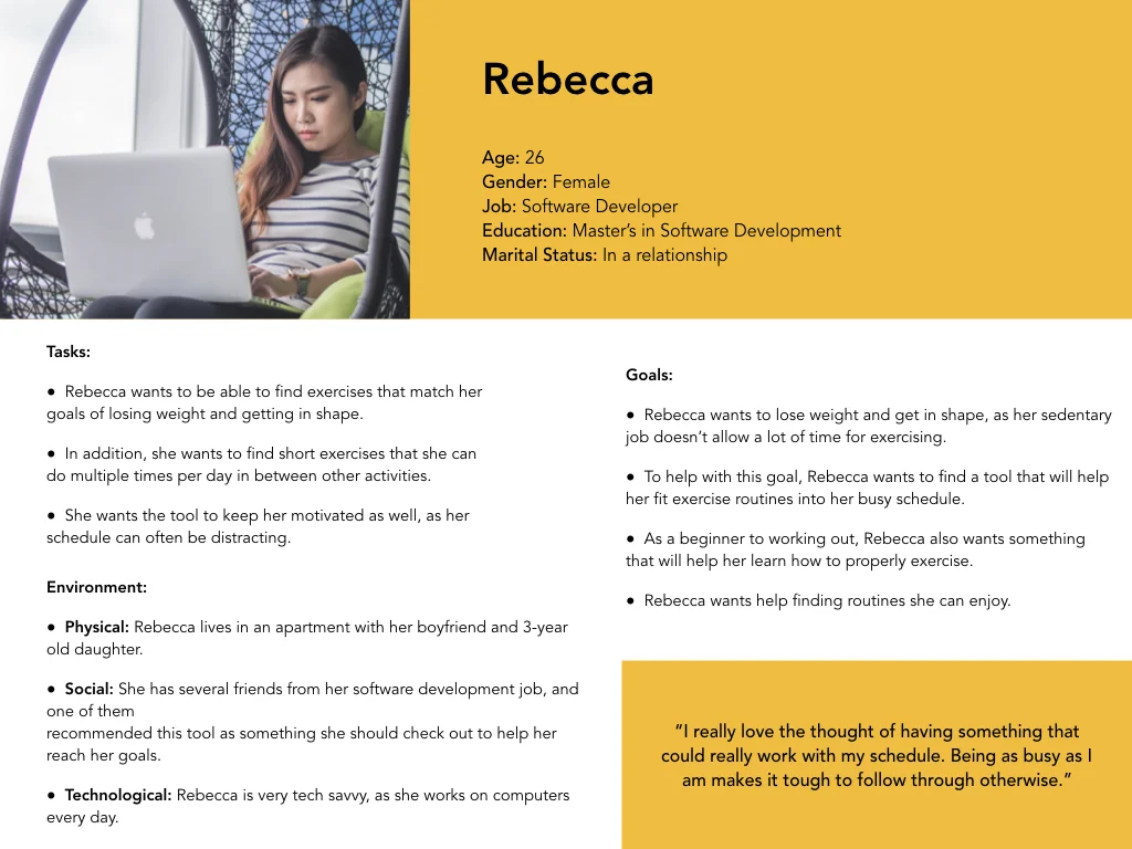
The prompt includes a persona, Rebecca. Rebecca offers a focal point that helps illuminate who would use Fitted and how they would be using it.
The Design Process
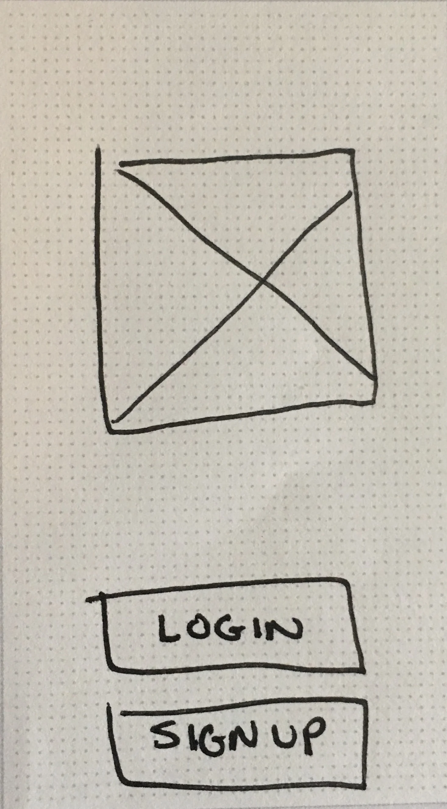
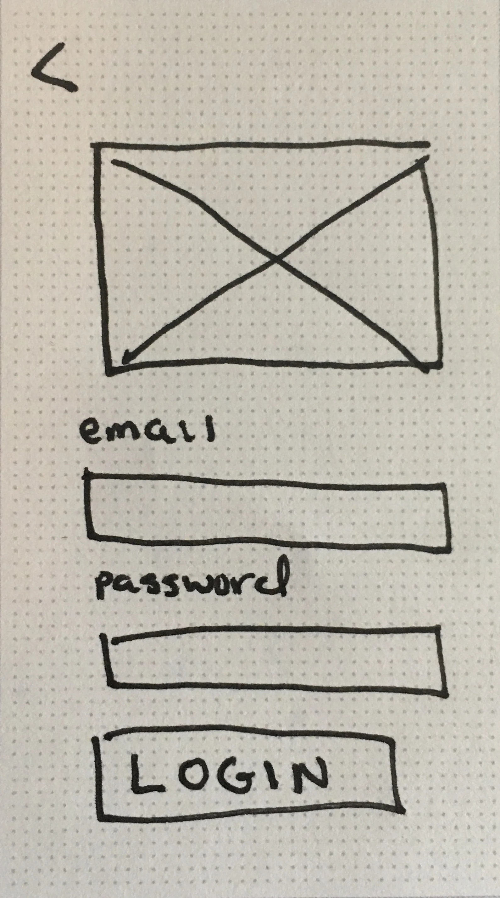
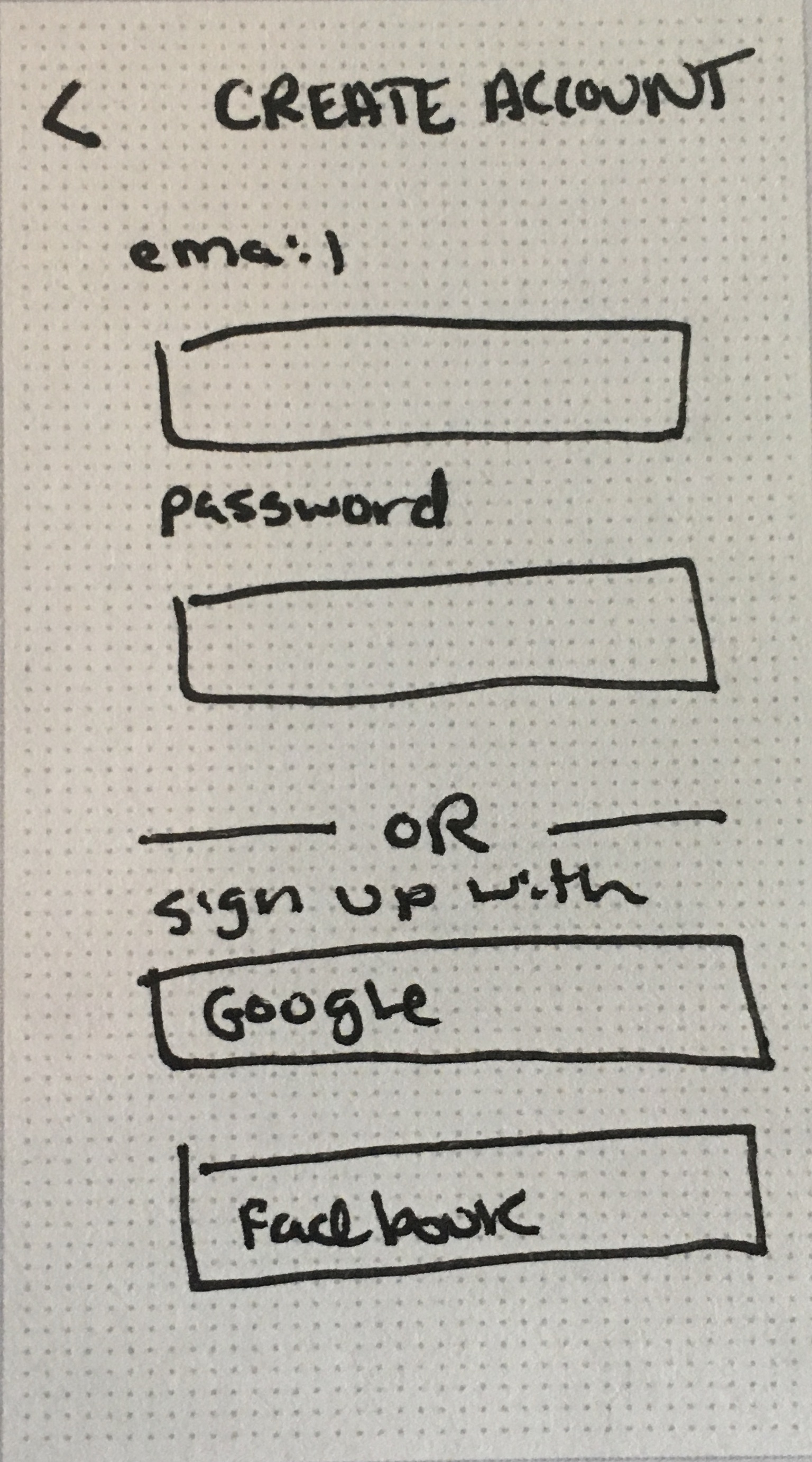
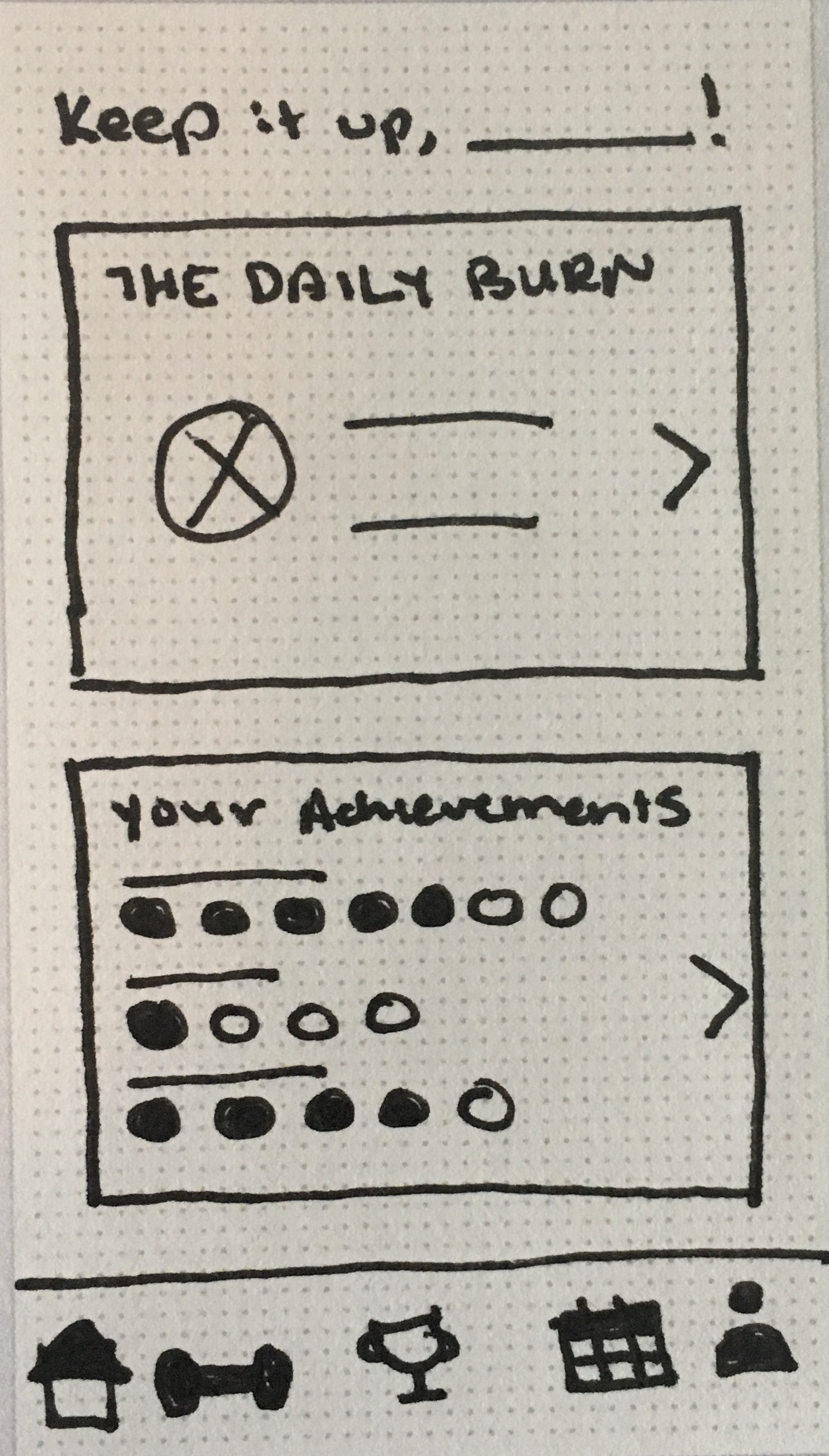
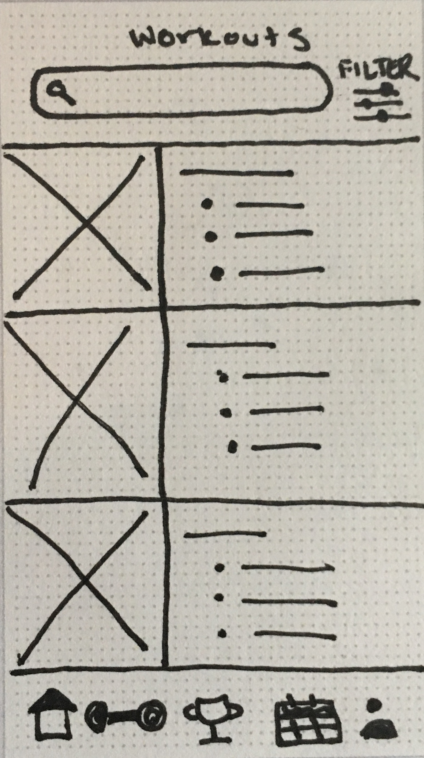
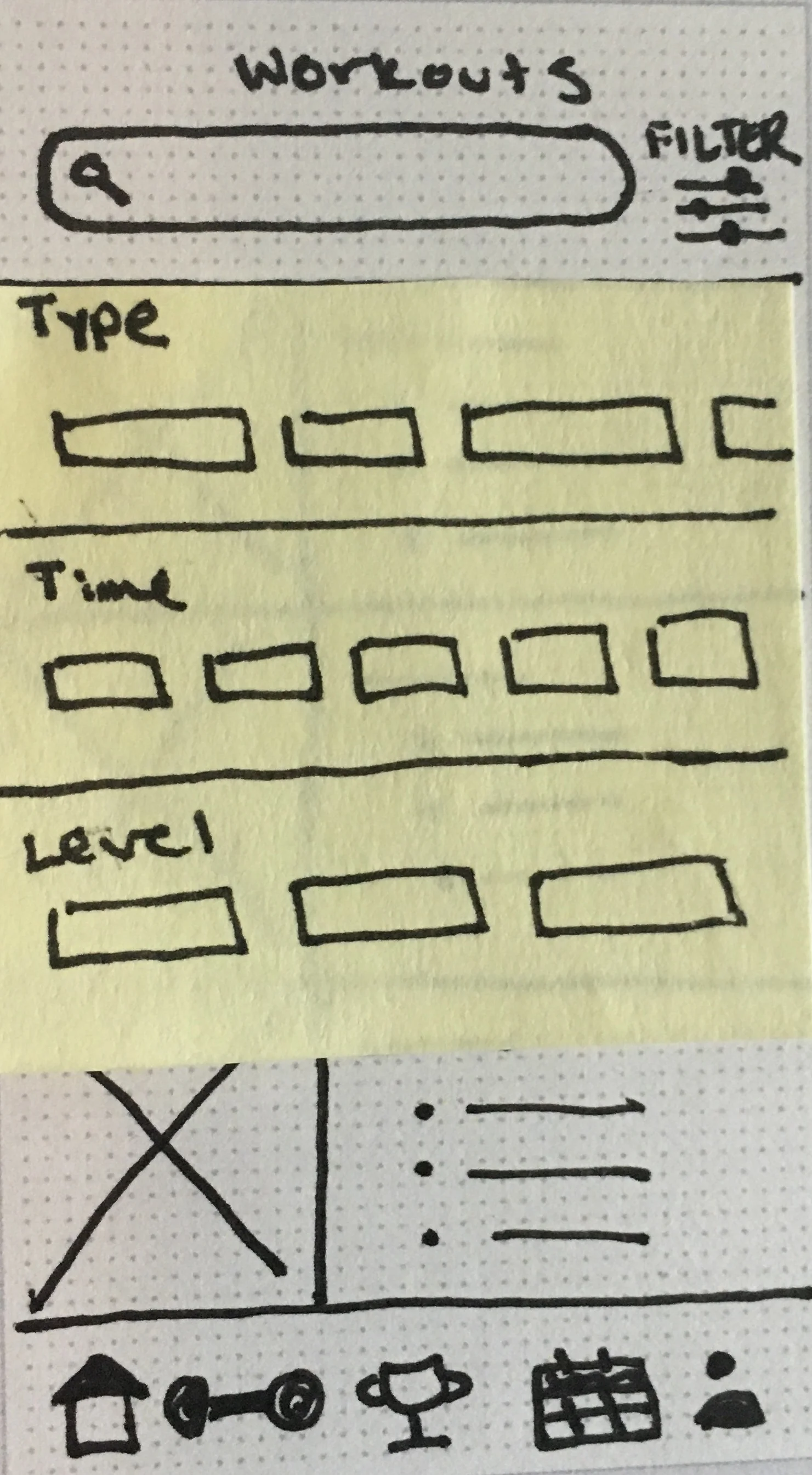
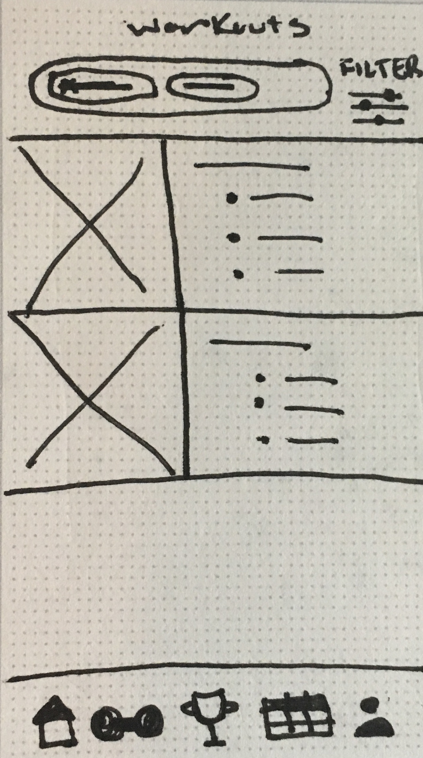
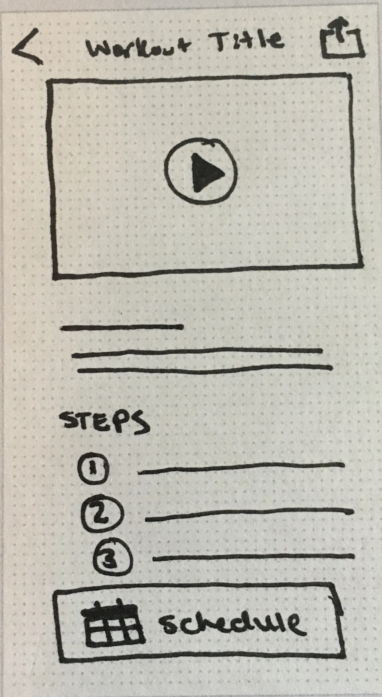
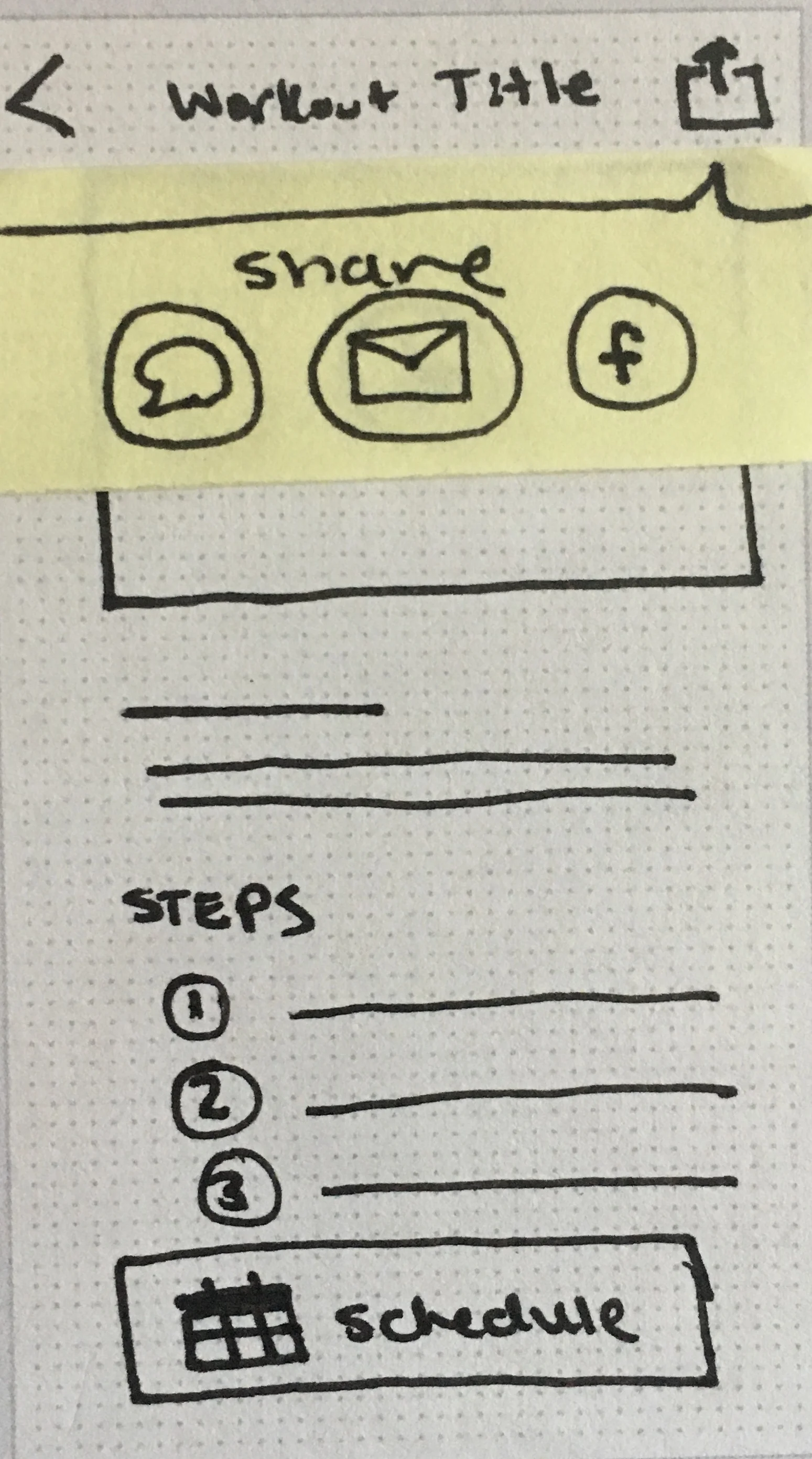
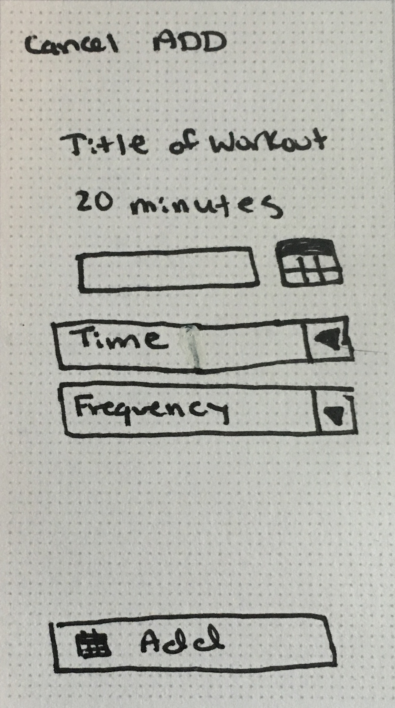
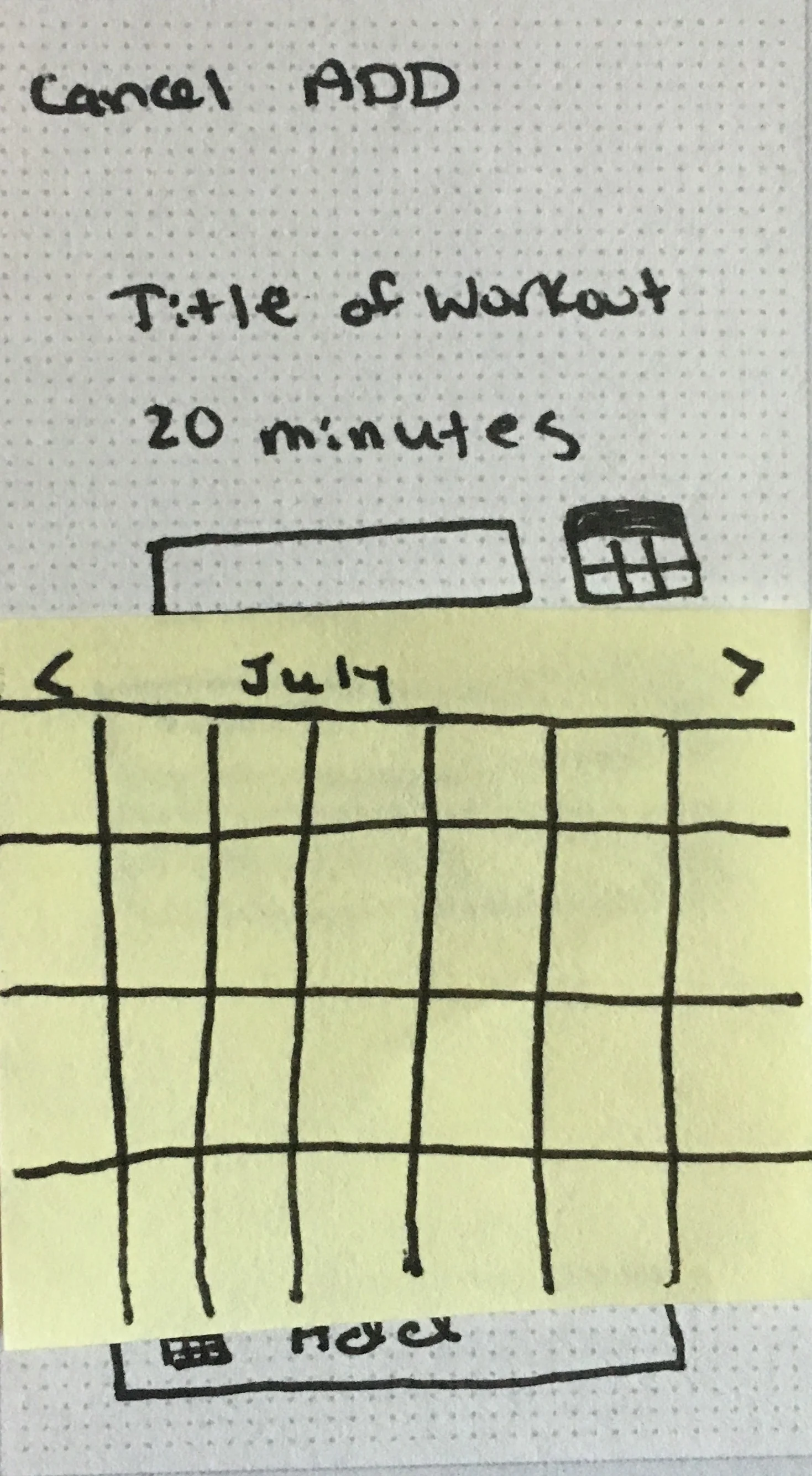
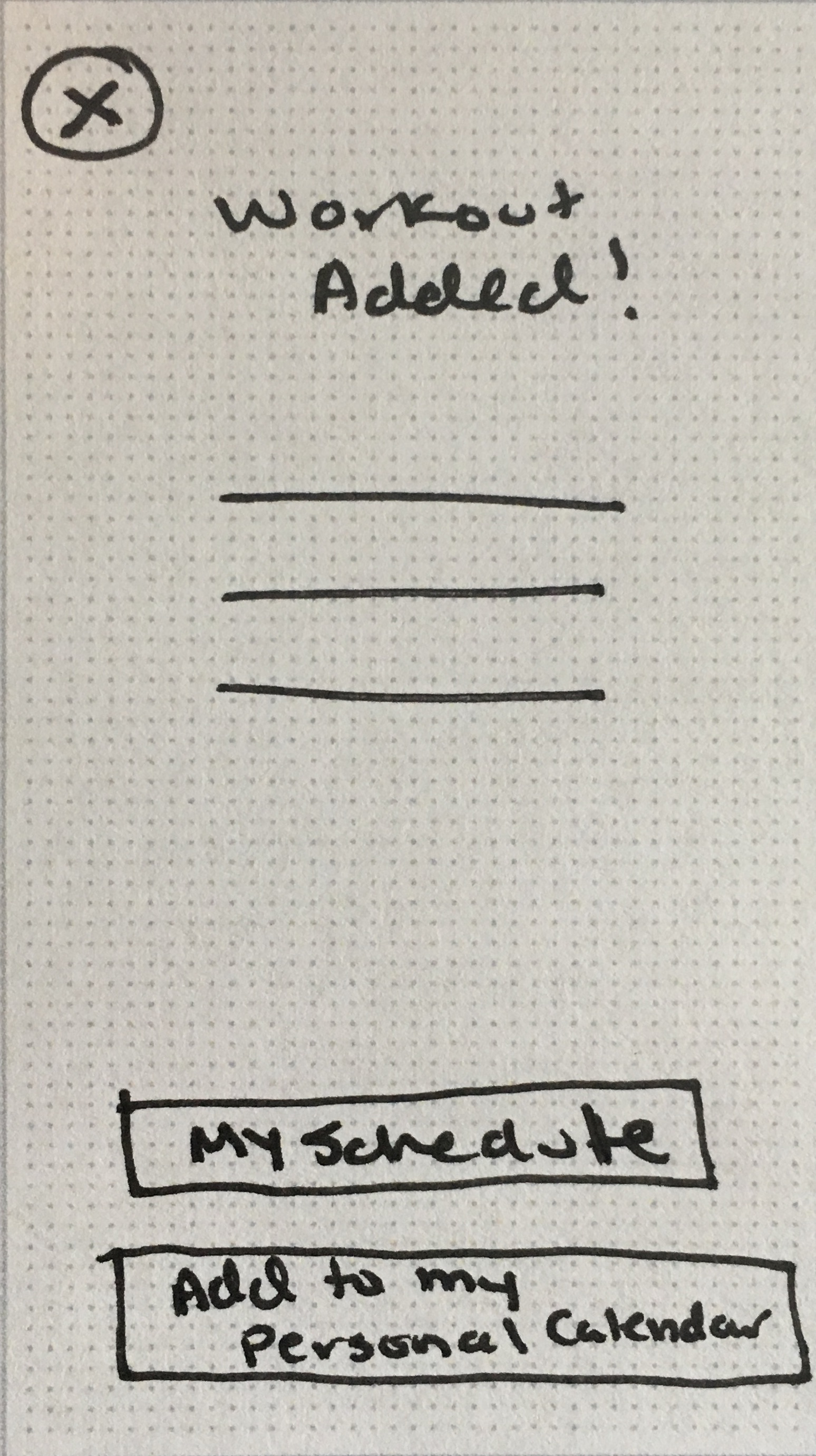
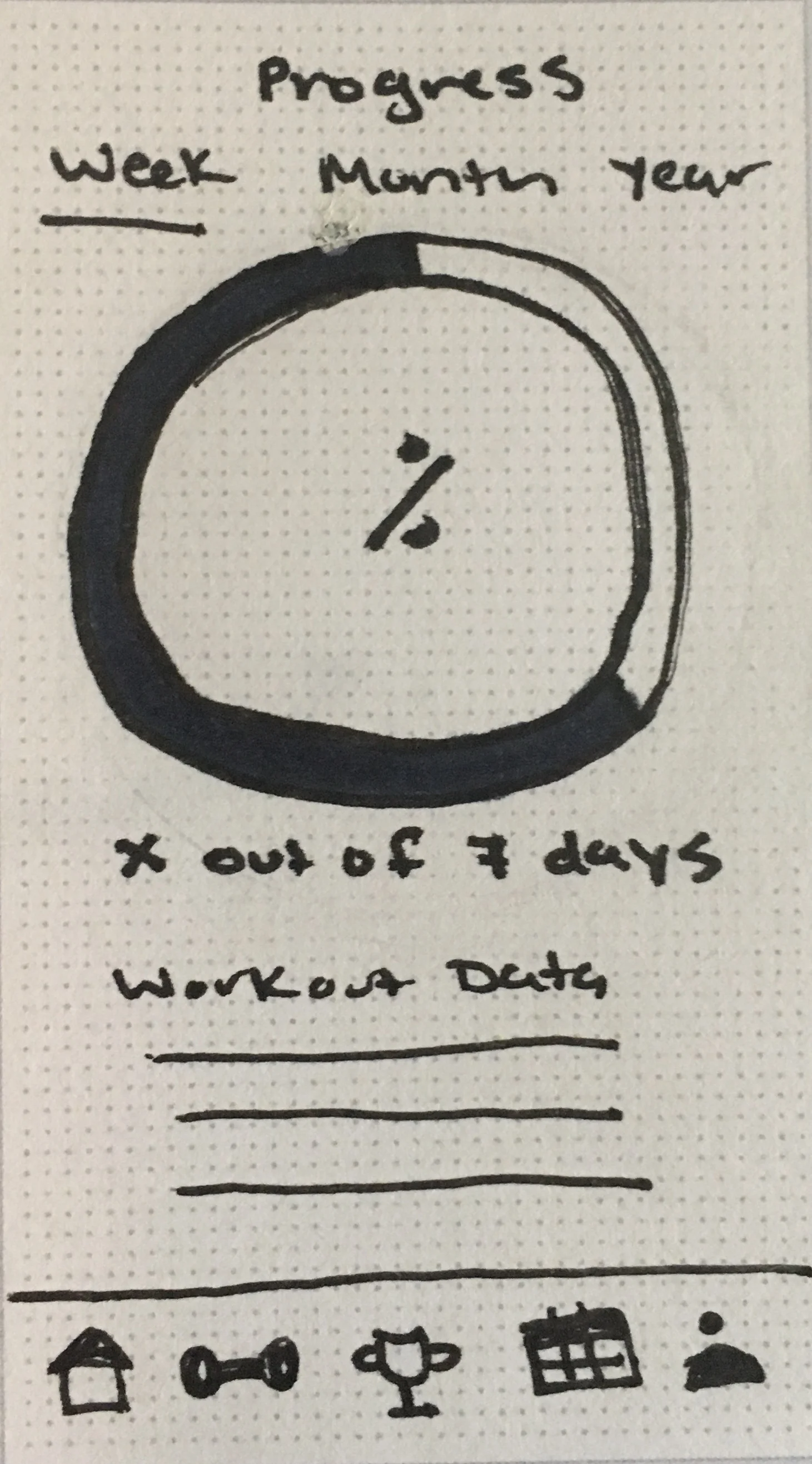
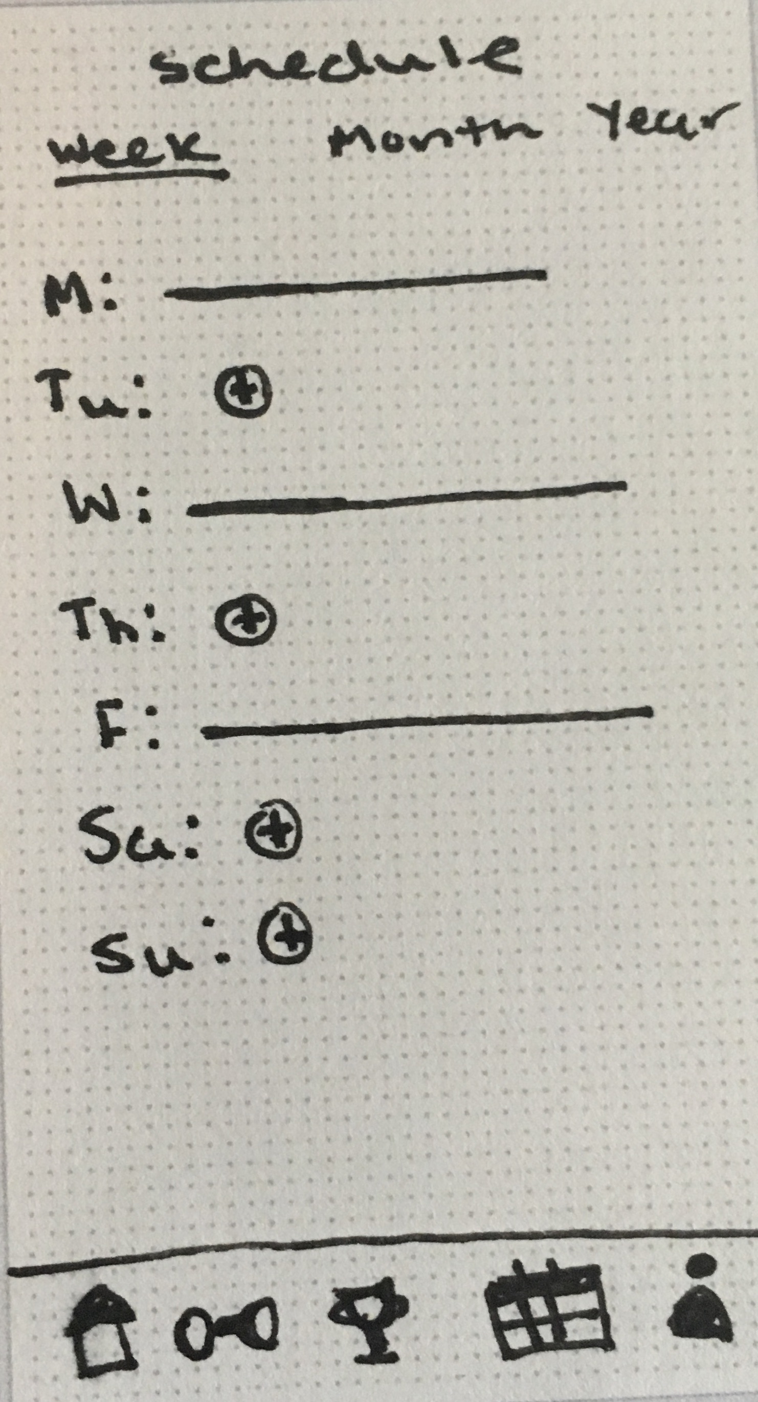
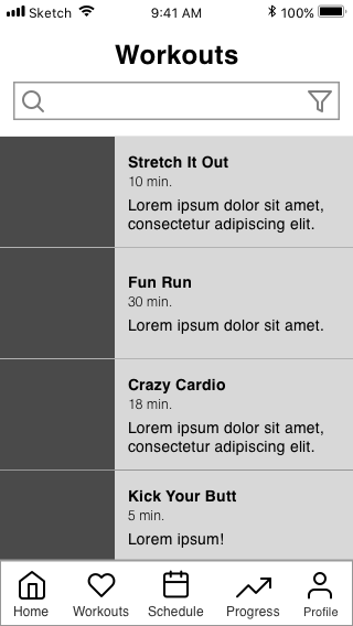
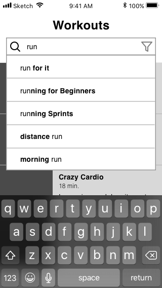
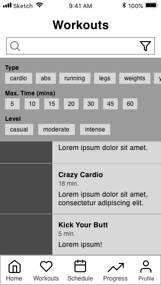
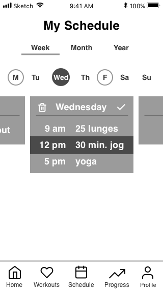
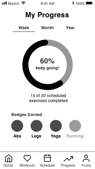
I created a basic user flow that included the required features and user stories given by the prompt. These flows dictated my low-fidelity wireframes.
I moved onto mid-fidelity wireframes. With the help of a grid system, I was able to create a layout with a clear hierarchy and proper spacing.
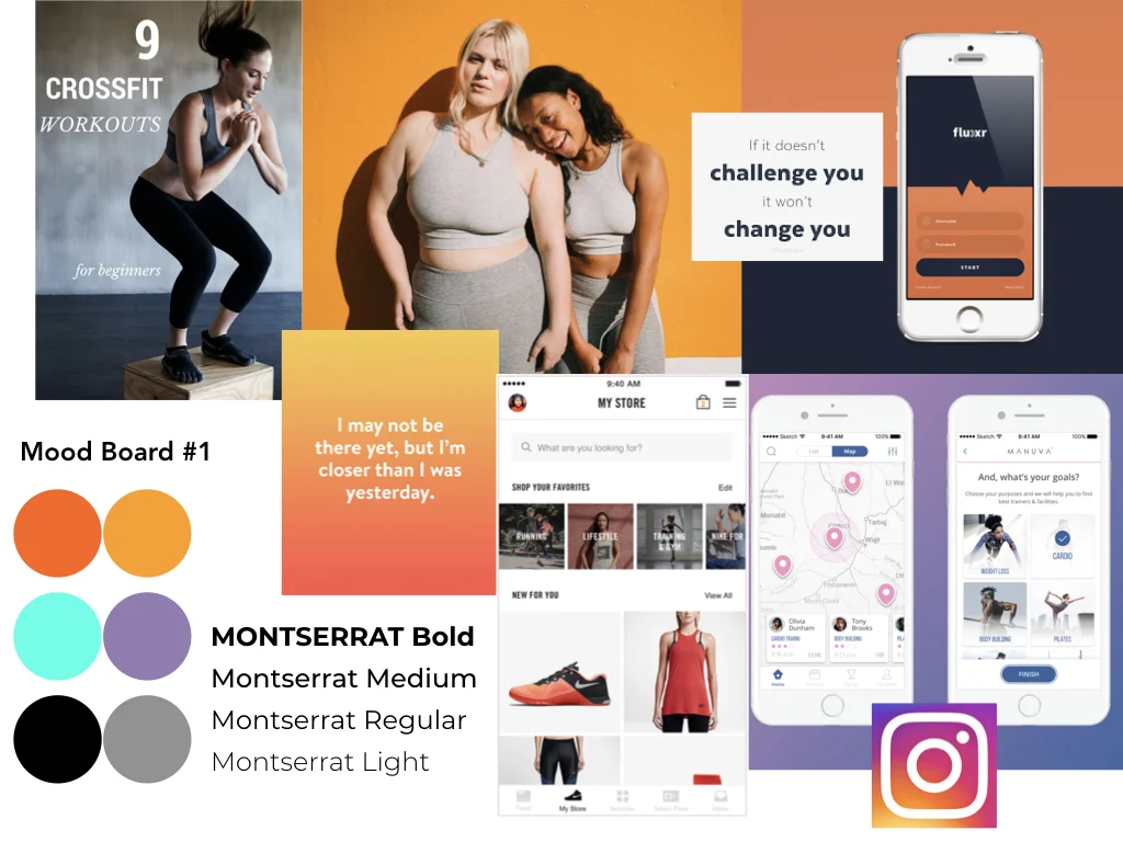
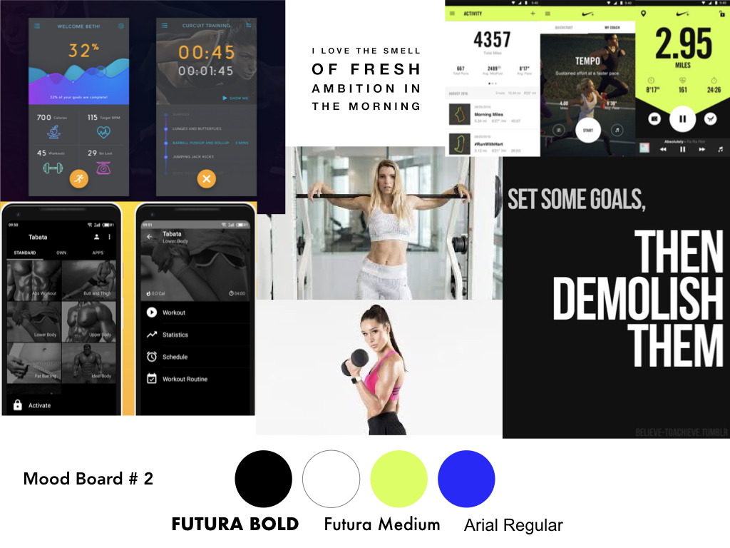
I created 2 differed moodboards that reflected possible paths for the app. I chose to follow mood board #1 because it fit the fun, fresh, inviting spirit of Fitted. I was inspired by the use of bold colors, modern fonts, and approachable imagery in popular wellness brands like Girlfriend and Ritual.
Mood board #1
Mood board #2
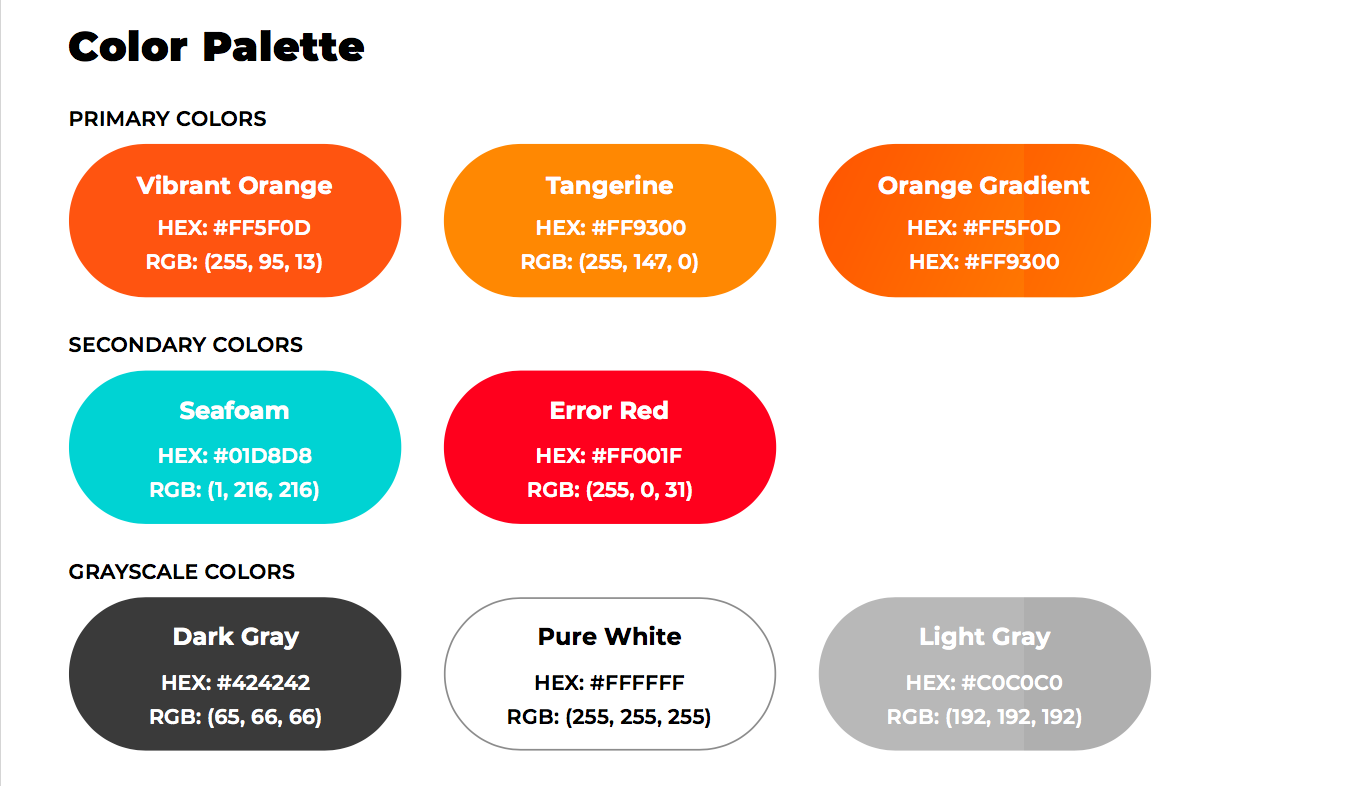
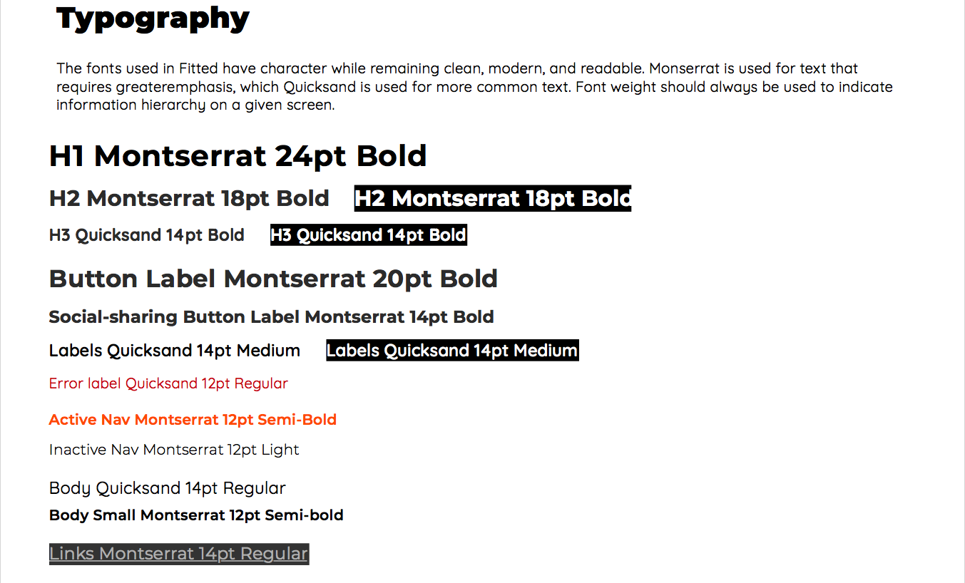
To ensure that there would be consistency in the branding of the app at each breakpoint, I created a style guide to reflect present and future Fitted designs.
I chose a mostly monochromatic color palette with a bright red-orange (Vibrant Orange, #FF5F0D) as my primary color. I also included a grayscale as a part of my palette to accent the orange and the black in the app. I chose Montserrat and Quicksand fonts to give a modern, clean, and fun feeling to the copy in the app. See full content of the style guide here.
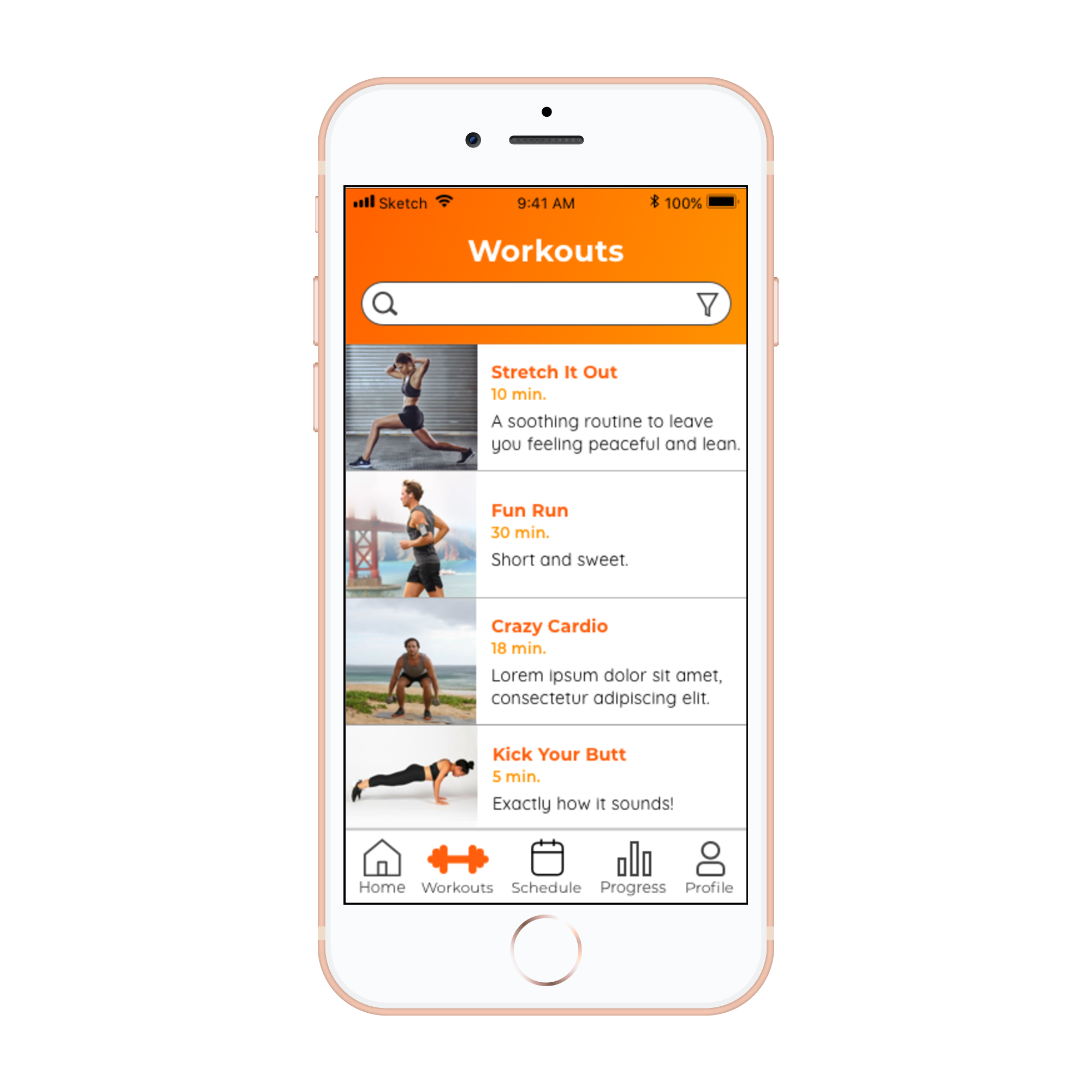
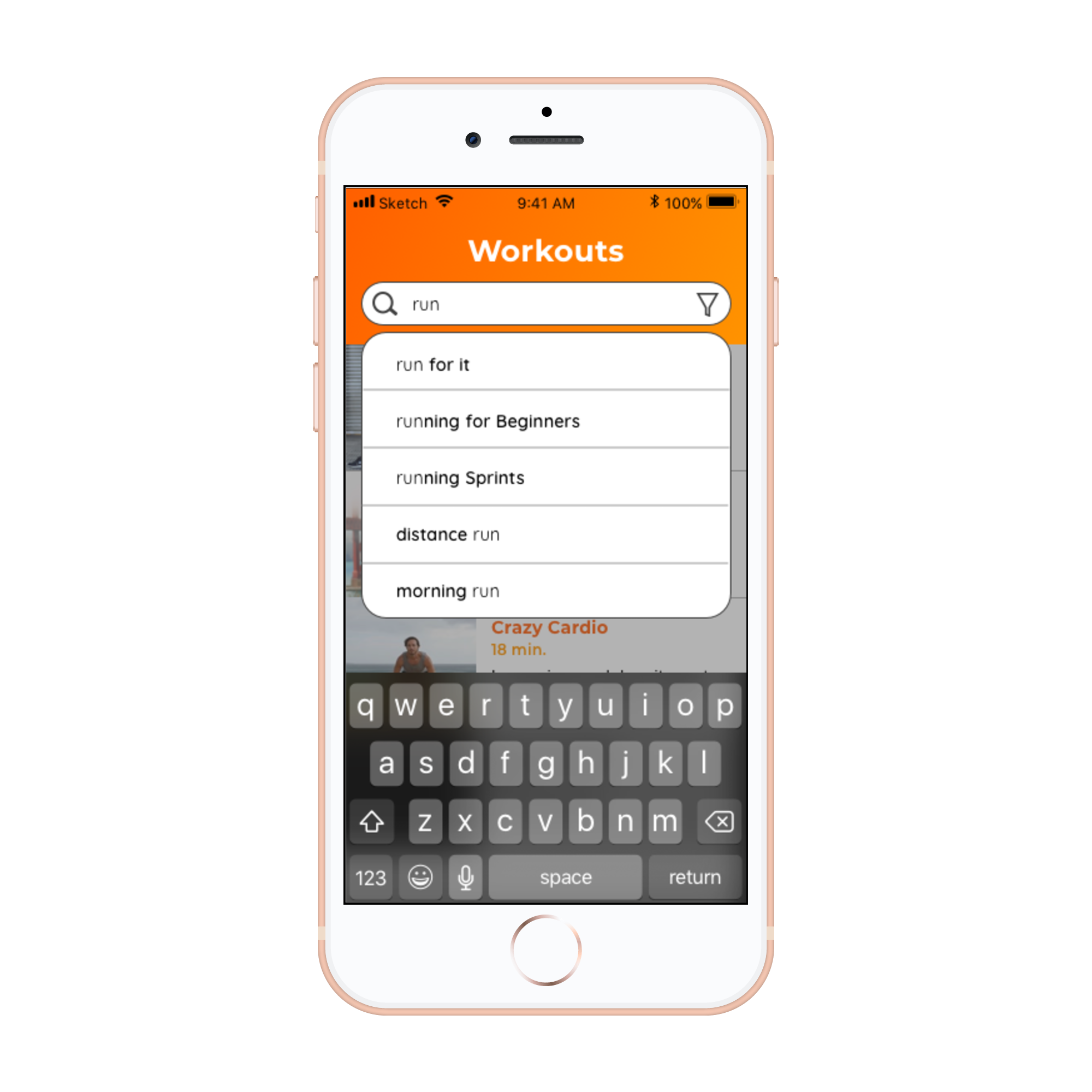
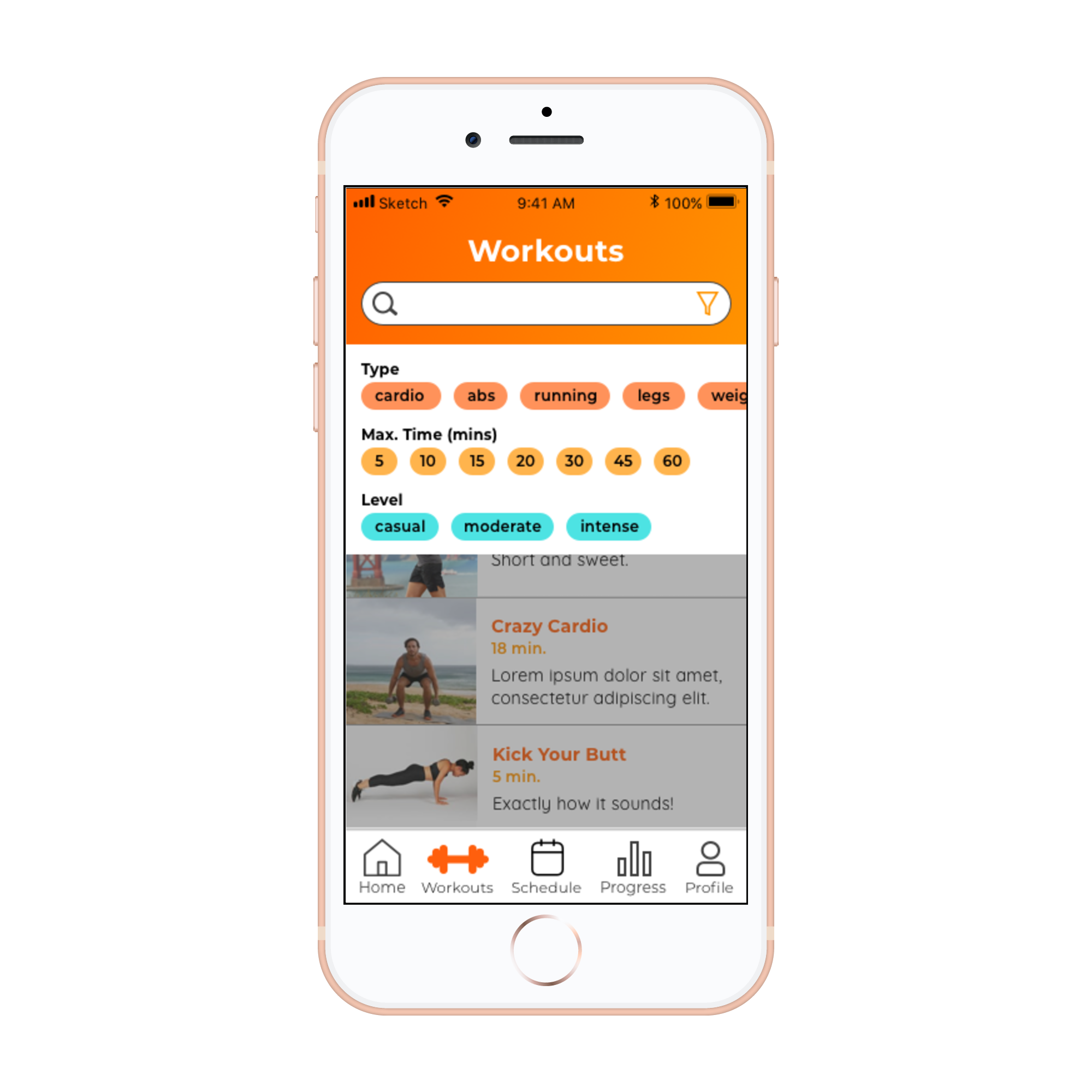
I applied the visual designs from this guide to mobile wireframes first. Check out the high-fidelity mobile prototype in Figma.
Designing for Responsiveness
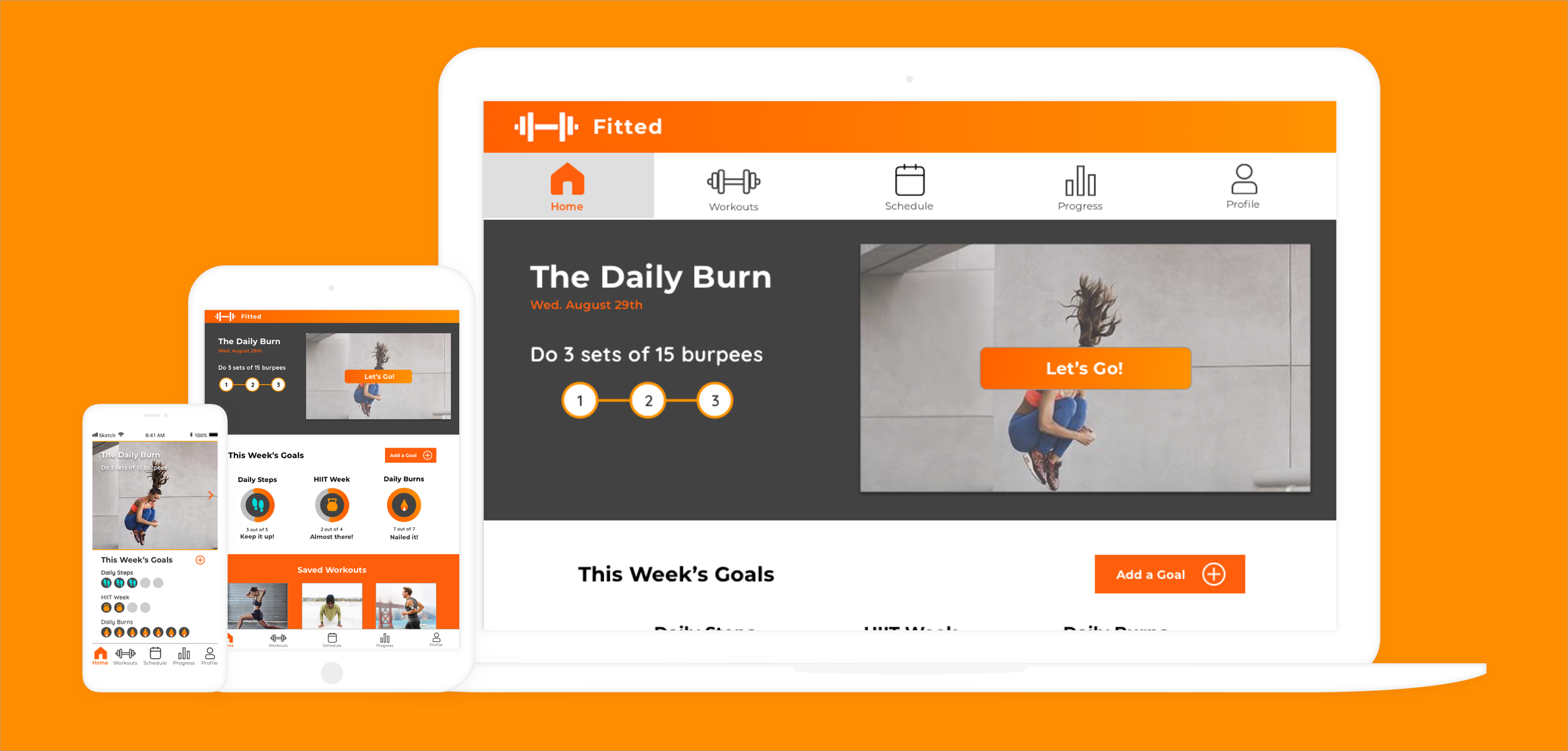
To begin making my designs responsive, I selected my tablet and desktop breakpoints and scaled my existing grid to fit via mid-fidelity wireframes.
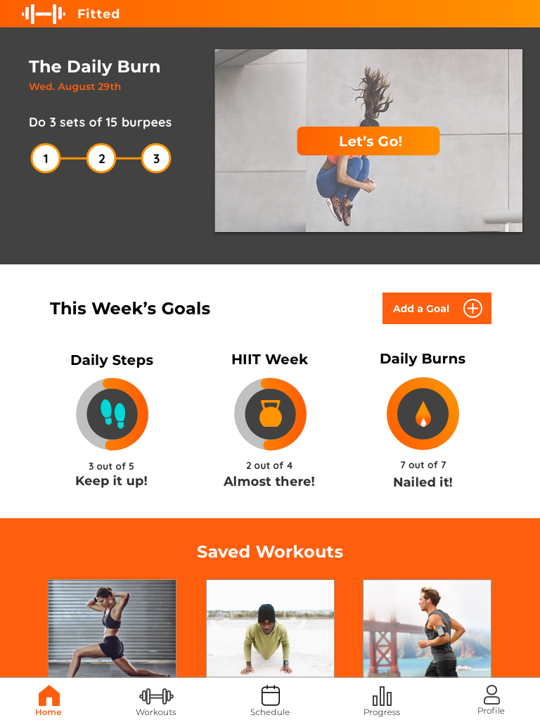
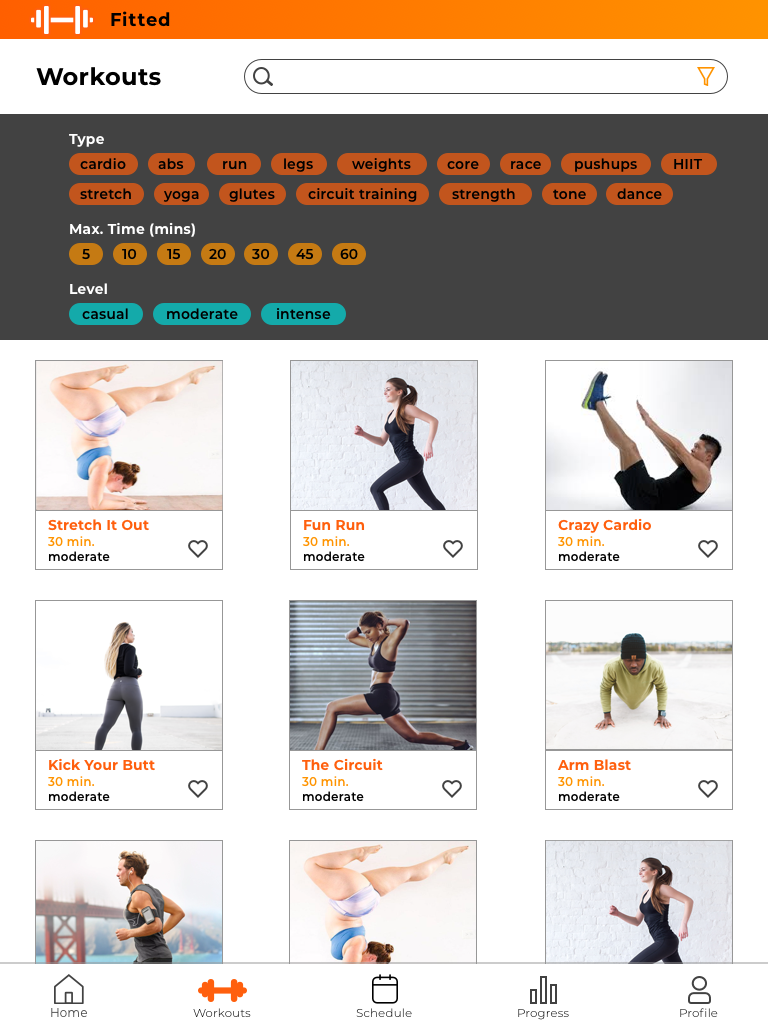
Tablet: 768px wide
Desktop: 992px wide
Finally, I applied the visual design as dictated by the Fitted style guide to my wireframes.
Thank you for viewing Fitted!

